
Day Trading Encyclopedia
Stock Charts Types of Charts
Line Charts
Types of Stock Charts
How the information is displayed is a function of the type of chart. Charts plot historical data based on a combination of price, volume and or time intervals. These are the three most commonly used charts for day trading.
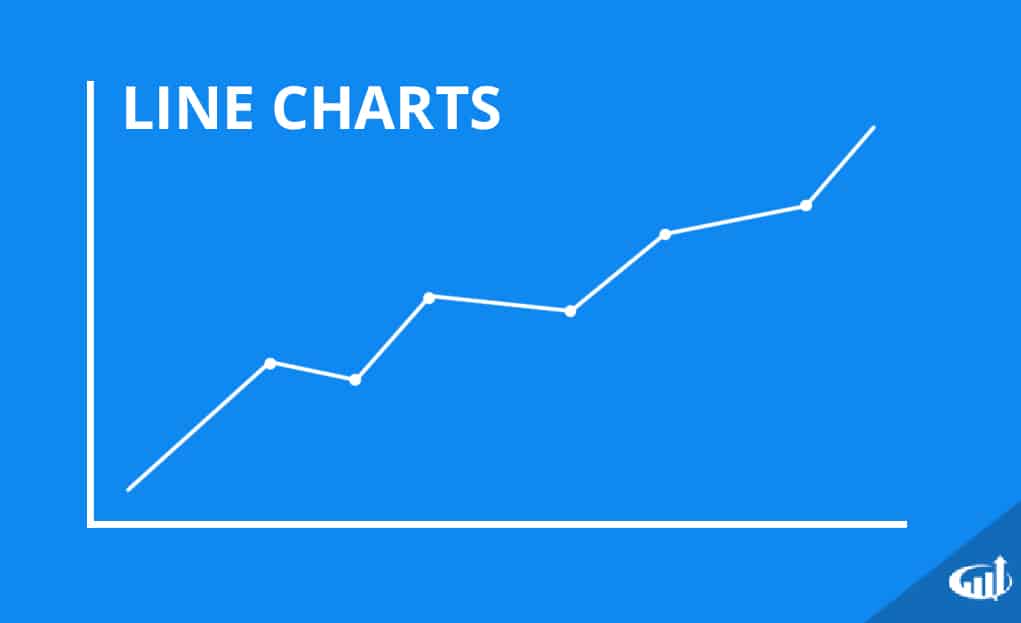
Line Charts
Line charts are composed of a single line from left to right that connects the closing prices (or any specified price data point) at each specified time interval. The chart looks like a basic graph. It gives a bird’s eye view of the historical price action in a single line. This is a popular type of chart used in presentations and reports to give a very general view of the historical and current trajectory. A common method is to draw trend lines to connect the peaks and valleys to anticipate potential price inflection and break points. For the most part, this chart may be a bit too simple for active day traders.
Candlestick Charts
Candlestick Charts
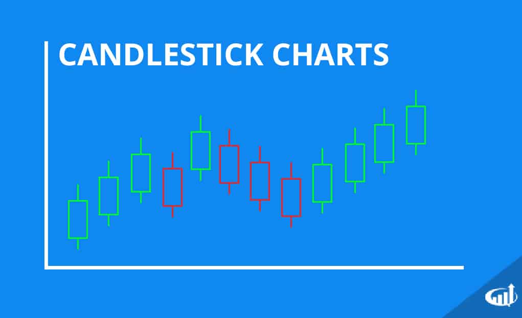
Candlestick charts were developed by Japanese rice merchants to track the price action of rice futures in the 1700s. Japanese candlesticks were first introduced to the United States through a book titled “Japanese Candlestick Charting Techniques” by Steve Nissan in 1991. The candlestick chart has become standard on almost all platforms and is the most popular style of chart used by traders. The chart utilizes the opening, high, low and closing price data per specified time interval to generate a candlestick, which is plotted on a price chart.
The candlestick is composed of three parts: the body, the upper tail and lower tail. Tails are also known as wicks. The body is composed of the opening price and closing price for the time interval also known as the period. The body is colored either green or red. A green candle indicates the closing price was higher than the opening price, which is considered bullish since the net result is price rise.
A red candle indicates that the closing price is lower than the opening price, resulting in a net price drop, which is bearish. The upper and lower tails are two thin lines extending from the top and bottom of the body towards the highest price and lowest price for the period. Traders often search for specific candlestick pattern formations to generate trade signals
Bar (OHLC) Charts
Bar Charts
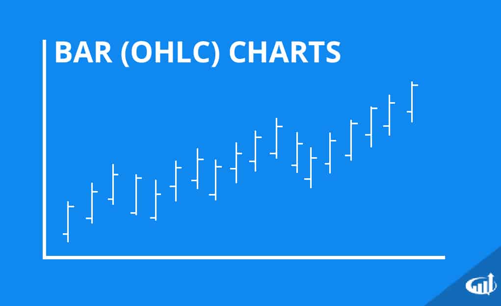
Bar charts are also known as open-high-low-close (OHLC) charts. They are the Western version of Japanese candlesticks. Bar charts simply use vertical lines that extend to the highest and lowest prices for the specified period and a short horizontal line extending left at the opening price and short horizontal line extending right to indicate the closing price. The color of the bar, similar to the candlestick, is based on the net gain (green) or loss (red) on the closing price. The coloring is optional.
The absence of a color filled in body between the open and close is the main distinction that between a bar chart and a line chart. Many traders feel line charts are easier to follow due to their simplicity. Bar charts tend to visualize the price range easier than candlestick charts, which tend to illustrate emotions. For example, a large red body can indicate pure fear (resulting in panic selling), which can be a distraction to some traders who prefer to maintain a neutral interpretation based on the price range expansion and contraction.
Point and Figure Charts
Point and Figure Charts
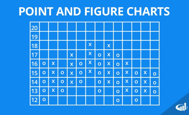
Originally developed as a price recording system, they have evolved to become a charting method. These simple charts only focus on the significant price moves, while filtering out ‘noise’. The X’s and O’s display very easy trends to follow and draw trendlines. The charts are composed of X’s and O’s representing net price changes. X columns represent rising prices and O columns represents falling prices. The increments can range from days to months and are labeled by numbers and letters. All labels are written in boxes. Each box represents an incremental period like one day or a range of days, all contingents on the price movement. Columns can be either Xs or Os but not both. The unique aspect of these charts is that the time input is not used on a linear basis, like candlestick, line and bar charts. As price rises or falls beyond a level, depending on the method, then a new column is started. This usually requires a price move equal to or greater than the reversal distance.
There are many varied ways to mark P&F charts from using just the close or the high and lows. Only one data point is used one box at a time. The simple X and O columns can already give a clear visual of resistance levels and the trends. In the example, the 19 is a clear resistance that is strong enough to exhaust buyers and reverse the uptrend into a downtrend back down towards the 10 support area. Tom Dorsey is one of the innovators of this methodology and has written much in-depth material on strategies to using P&F charts.
Start Day Trading With Our Trading Simulator FREE for 14 Days!