
Day Trading Encyclopedia
Chart Patterns Trend Lines
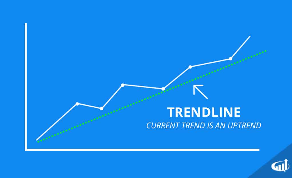
Trend lines help day traders identify general market sentiment for a given time period.
Trend Lines
To better visualize the trend, trading range, support and resistance levels on a chart, traders commonly use trend lines. Most platforms have trend line features to draw them manually and some even have the software draw them in automatically. Automatic trend lines may not be as accurate since the starting point can be subjective. Seasoned traders prefer to manually draw in their own trend lines to ensure accuracy.
Drawing Trend Lines
Trend lines are drawn horizontally or diagonally. The basic trend line will connect the lowest lows on the candlestick or bar charts from left to right and the same applies for connecting the highs. Not every candle will touch the trend line. The objective is to connect the lowest and highest points either at the wicks or the bodies. This will generate a trading range also known as a channel. The upper trend line is considered a resistance and lower trend line is considered a support. Traders can draw multiple trend lines with different starting points. However, it is important not to overdraw too many lines.
Trend Line Starting Points
The starting point of the trend lines is subjective to the individual trader and the pattern. Starting trend lines too far back can lead to obscure channels. The basic starting point should be at the highs and the lows of the specified time frame. Subsequent time frames can be drawn as the time interval gets smaller or as the range gets tighter. Based on the trend lines, traders can determine if a potential chart pattern has formed or getting ready to form.
Diagonal Trend lines
The biggest question when drawing trendlines is where to start the first plot point? A general rule of thumb is to work left to right on the chart. So the starting point will either be a high or a low of a range starting on the left side and then connecting the significant lows in a single diagonal line. If the stock is downtrending then connect the highs to reflect the lower highs.
Uptrends
Uptrends are composed of higher highs and higher lows. These can be visualized by adding a diagonal trendline connecting the lows from left to right on the chart.
An example of an uptrend
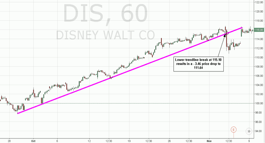
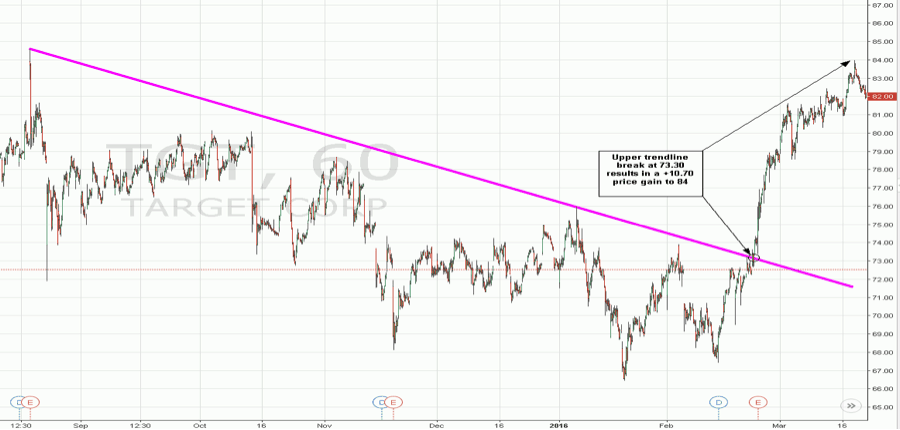
Try to have at least 3 points of contact with the trend line for the most effectiveness. Effectiveness can be measured by the magnitude of the break. Large moves that form after breaking the trend line are the best proof that it was drawn correctly.
Downtrends
Downtrends are composed of lower highs and lower lows. These can be visualized by drawing trend lines from left to right. The downtrend remains intact until the upper trend line resistance gets broken at which point a trend reversal can form.
An example of a downtrend
Horizontal Trendlines
Horizontal trend lines represent a very solid resistance level if stock is trading below it and a support level if the stock is trading above it. These are effective for ascending or descending triangle patterns where the resistance remains the same while the pullbacks become more and more shallow until the horizontal trend line breaks or causes a trend reversal.
Upper and Lower Trendlines
The question of whether an every chart needs to show upper and lower trend lines is a common concern. Remember that trend lines should be utilized to capture periods of symmetry, whether it applies only to resistances but not supports and vice versa. Usually a single trend line to illustrate a trend will suffice. There are situations where only one resistance or support trend line is needed. In fact, adding the other trend line can do more hard than good especially when one side is steady while the other side is crooked. Only use two trend lines when potential patterns like triangles, flags or wedges may be forming.
Stock Market Trends Across Multiple Time Frames
A stock can be in an uptrend and a downtrend simultaneously. The distinction comes from determining which time frame to prioritize. This is contingent on what type of trade you may be implementing or considering. Long-term investors should prioritize longer time frames like weekly and monthly charts. Swing traders that take positions for several days should prioritize the 60-minute and daily charts. Intra-day traders should prioritize intra-day time frames ranging from the 1-minute to 60-minute charts.